DIY your bakery logo in Canva
Last week I talked about the importance of branding your baking business, and all the different areas where branding extended to. As I mentioned, if it’s not the most important part of your brand, your logo is certainly what most people will come into contact with first, be it on your Facebook page, website or business card. That’s why it’s important to have a professional looking logo right from the start. Unfortunately though, when you’re new to business you might not have the spare money to spend on hiring a graphic designer, so what do you do? Well, you can do it yourself!
WHY DIY?
I definitely believe it’s wise to invest in good design for your business by hiring a professional, but I also completely understand it is not always realistic for new business to finance it. However, it is important to have some kind of image or logo right from the start that people can recognise and remember you now. Here’s why DIY-ing a logo is a good start:
Most importantly, it will save you money which you can invest in other areas, like kitchen equiptment
You will look professional right from the start
It can be a great start for when you are able to work with a designer, you won’t be starting from nothing and will have an understanding of what you really want
You can start to build a cohesive look throughout your business
A logo will help you stand out from your competition and be more memorable to your customers
WHAT ARE THE OPTIONS?
So you’re keen to give it a go, but where to start and what software to use?
The most commonly used programs for graphic and logo design are Adobe Illustrator and Photoshop. These are extremely powerful design tools which are great to work on, but do have a bit of a learning curve, especially if you have never worked on them before. They are also at the top end of the price scale, although in the past few years Adobe has brought out a monthly membership to their programs making it much easier to afford, they also offer a 30 day free trial of all of their software. I use the Adobe suite of software for my design work and I love it because you have access to all of their programs with your monthly subscription so I can edit videos, build websites, edit photos, create PDFs - it’s very handy!
CorelDraw
Similar to the Adobe software, powerful graphic design tools but will take some time to learn. It is a slightly cheaper option but the suite of software is much more limited than Adobe’s. Honestly, I’ve not used Corel since I was in high school so I can’t remember much about how to use it but one of my bosses swears by it! They also offer a free trial so you can have a go and see what you think.
Canva
This is the software I am using for today’s tutorial. It’s an online graphic design tool which is very user friendly, sort of like the Squarespace of logo design tools. There are lots of pre-made graphics and templates to chose from for business cards, social media headers, blog graphics. Of course there are limitations to what you can do with it, but honestly that really is helpful for people who don’t want to learn complicated software and just want to produce something that looks simple but professional. I’m sure that many graphic designers would curse it, and of course I’m not saying it replaces the need for trained designers, but for some people, it is the perfect solution. And it’s free! You only pay a subscription if you want certain features but it is about ¼ of the price of the Adobe program suite.
Squarespace
Yes, I’m talking about Squarespace again! As someone who champions the platform for websites I am compelled to mention that they also have a basic logo designer built in to their website builder. It is simple, even more so than Canva, but if you just want to get up and running with slightly more than your name in basic text it’s a great starting point.
WHY CANVA?
The reason that I’m suggesting that you start with Canva is that you really haven’t got anything to lose. After the few minutes it takes to sign up, you get started right away. As it is free to use you don’t need to input any card information and you can jump right in. There are also loads of templates which can give you a helping hand and inspire your own design ideas. Basically, I think it can’t hurt to have a go, and if you find it’s impossible or you just want to pay for someone to do it for you...well you’ve only lost about half an hour.
Oh...and you should check out the Services page on this site ;-)
LET'S BUILD A LOGO!
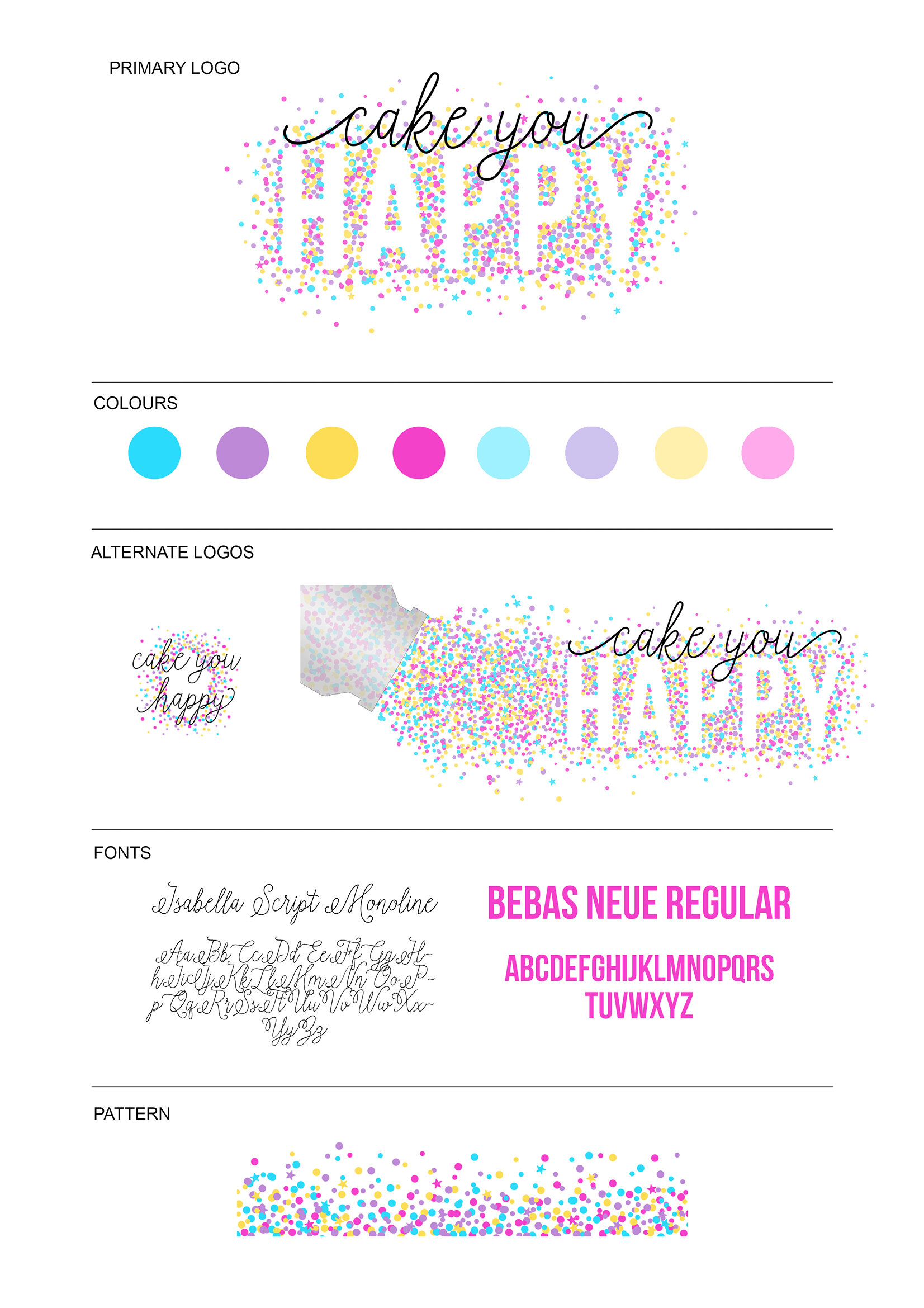
Check out the video below and I will take you through creating the very simple logo above. However, once you’ve followed along with the video, the best way to learn is to just keep playing about with it. If you’re having trouble or anythings not making sense, get in touch using the links at the bottom of the post, I’d be happy to help.
Important note - Normally, the best way to save a logo once it’s completed would be as a PNG file. This allows you to save the logo with a transparent background, which can then be used on photos or coloured backgrounds, without a big white rectangle behind it. The people at Canva obviously know that, so you enable that feature you have to have a paid account. They do, however, offer a free trial of the paid account. So if you wanted, you could get all your logos set up and ready to download, activate the free trial, then download the images with a transparent background in PNG format. You might even find that the paid version has content that you like and use and decide to keep it, but it’s great to know that there is a free version available which can produce really good results.
Another thing to think about before diving in to your actual logo design is to do a little bit of planning. I will be writing a detailed post about this next week, but putting together an inspiration board or a style guide before you get started will help guide you when you’re designing your logo. All it needs to be at the start is a Pinterest board of colours/fonts/images/logos that appeal to you, and that you think would appeal to your target customers, which you can then use as a reference when you get going.
Finally, the best advice I can give is KEEP IT SIMPLE. Less is more when you’re new to design. One or two fonts and a limited palette of colours. You must have a good eye for design though because all of your kitchen creations look beautiful, I’m sure!
Good luck, and as I said before, any questions please get in touch.


