How to structure your baking business website
I’ve talked before on the blog about the importance of having a website for your business, so today I’m going to go into a little more detail about what that website should look like and how it should function. It doesn’t have to be complicated but there should be enough of a structure to allow your potential customers be guided through the site on a coherent path.
What is the purpose of your website?
Firstly you must decide what you want out of your website.
Will it be...
An online shop to sell your products directly?
A portfolio for your cake creations?
Somewhere for people to understand your brand and make contact with you?
A blog sharing behind the scenes from your kitchen or baking tips?
An information hub for you to direct customers to, containing answers to FAQ’s?
Your website can cover a number of these elements but it should be serving one primary purpose, meaning when visitors land on your page they understand straight away what they are to do.
The homepage
Your homepage is where the majority of people will land when they visit your website so it has to be clear and inviting. Think about the different purposes your website can have, mentioned in the paragraph above, and how you can highlight this aspect.
It should also very quickly convey your ethos/style/brand, which helps both you and the customer. For you it should cut down on requests for bakes and cakes that are not in your repertoire and for the customer it will avoid them wasting their (and your) time getting in touch about something you don’t offer.
There should be one sentence or very short paragraph that will instantly convey who you are and what you offer.
Let’s look at some examples!
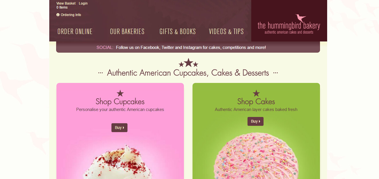
The Hummingbird Bakery website displays two very clear messages on their homepage. Firstly it tells your exactly what it provides 'Authentic American cupcakes,cakes & desserts', then it directs the user to their online shop. This makes sure potential customers don't get sidetracked by less important content at first and focuses them on buying cakes or cupcakes.
LIGGY'S CAKE COMPANY
Liggy's cake website is primarily a portfolio showcase of all of their cakes and bakes, split into various categories but again the brand message is clear '...we create special cakes for special occasions.'.
I'm quite in love with the Dot's Cupcakes website. The logo and tag line succinctly tells you what they're about - fresh baked cupcakes. The 'hero' image (web design speak for the main picture at the top of a page) also reflects their brand - fun, lively and celebratory. Below the beautiful image are three simple options to guide the customer.
Additional content
Once you've got your homepage set up the rest of the content will, again, depend upon the purpose of your website but some typical pages for a bakery website are:
GALLERY
Quite obviously this will be the showcase for all of your beautiful creations. If I could give you one piece of advise for the gallery it would be that you don't need to display every single cake you've ever made, especially if you are trying to focus in on one niche. When you are starting up you will be happy to take all types of orders (and this is definitely the best thing to do) until you have honed your skills and identified the area you excel in. Once you've build up a collection of, say floral wedding cakes, begin to display just these types of cakes on your site and you will soon by the expert and go-to baker for that style.
MENU/FLAVOURS
You may or may not want to list your favours on your website. Maybe they change constantly, or maybe you simple offer a limited range of sponges. If you feel it's appropriate to your business this can be a great place to explain what's in your cakes, such as highlighting local or seasonal ingredients.
PRICING
It can be difficult to post prices for your cakes on your website as so many designs must be prices on a case by case basis. Again it can be a good way to give your customers an idea of where your prices start, to avoid any time wasting. Items like cupcakes or cakes pops are also more likely to have standardised pricing which can be shown here as a guide to customers before they order.
ABOUT
Your about page doesn't need to be your life story but everyone loves to be a bit nosey and a short bio would be perfect here. You can also expand on that tag line/bakery ethos from your home page to give customers are real understanding or your baking passion and what they can expect when ordering from your company.
CONTACT
Quite self explanatory really!
BLOG
A blog can be a great way to keep your customers up to date on changes to your menu, behind the scenes at the bakery or a place to expand on the frequestly asked questions! It can also send more traffic to your website as people may come across one of your articles first then end up checking out your cake business! Have a look at the guest post by Lauren which runs through seven great ideas for your blog that will get your creative writing ideas flowing!
FREQUENTLY ASKED QUESTIONS
If you find you are getting asked the same questions over and over, have all of the answers in one place on your website, that way you can direct your customers to this page rather than typing out the same email 50 times. It is also a great place to explain cake sizing, portioning or your delivery rates.
IMAGES
One final point I want to touch on is the images for your website. As you'll already know as a baker, most people eat with their eyes, or in this case make up their mind about your business with their eyes! Having well composed, bright, high quality images will make or break your website. A small number of perfect images is infinitely better than a collection of poorly lit snaps in your kitchen.
It can be done by yourself. There are many, many tips online but my quickfire advice would be:
natural daylight is your friend
a consistent, plain background on all of your images will give a cohesive look
use your best plates and cake stands to add interest to your shots
light editing to brighten pictures can really take them to the next level
I am of the opinion that less is more on websites. Keep it simple and offer the information that is the most important to your customers. Don't just fill up your site because you can and be selective with high quality, useful content.
Sign up to the Freshly Baked Newsletter and receive a free Website Planning Guide!


